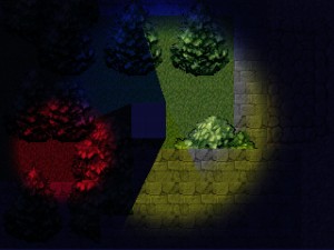
Hi there!
During the month I’ve had two streams of work in progress. One being my personal game projects (for 1gam) and the other being the Blunt Instrument projects. We are currently prototyping a couple of new games and that tends to take most of my time.
It’s been a hectic start to the year for me but it’s starting to sort itself out now. I think I’ll have a game by the end of January! Even if it’s just the one that comes from the GGJ next week.
My 1gam projects are going to be small jam-able games that I can finish and release in a short amount of time so as to not interrupt my regular development work too much. They also might end up being worth some extra loving in the future too….
This post has turned into something completely new for me… I managed to keep track of a few things as I was doing a bit of work. I’ve used that captured essence to conjure what lays ahead. It’s a bit of a mess and probably not interesting for anyone but it was kinda fun to do so I may consider doing it for each month this year.
![]()
I originally meant to be making a simple board game for the iPad/iPhone. However I abandoned this idea when I encountered a few issues that weren’t going to get resolved in quick enough fashion. So I moved on to a light + shadow style game with a retro pixel art style. After getting a quick prototype working I’ve been trying to add some interesting lighting and hopefully a cool style. Part of the style involves heavy use of dynamic lighting. Please ignore the crappy sprite layout used in the examples!
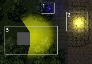
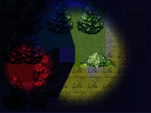
To facilitate a 2D dynamic lighting system in unity I tried out combining a ray-cast style volumetric light+shadow system with the regular unity lighting (without the shadows). Here’s an image to give an idea of what I’m trying to achieve. I want to combine the dynamic shadows of (3) with the lighting used in numbers (1) and (2).
My first thought was to switch to a deferred lighting model and attenuate the lights with the shadow mesh before drawing them into the buffers but this wouldn’t work for low-end and mobile devices.
Next I figured to try and do some dynamic light maps generated with custom shaders. This would allow each light source to be drawn into the scene with it’s shadow included. I can then use this lightmap in the sprite pass.
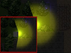
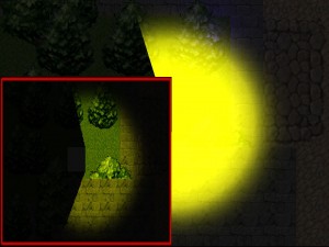
So first I set up a render texture and made the scene draw to it. The image (b) shows the render texture and the problem with the lighting/shadow not being combined. The red box is the render texture.
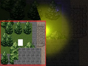
So next I need a version of the scene with just the textures. I’m very much thankful for Camera.SetReplacementShader(..) . It allows a camera to be drawn with a shader overriding the defaults(c).
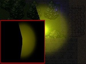
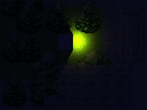
Now I need a lightmap to draw all the lighting into. This is easy, I’m just drawing the lighting into the render texture as the first pass of the scene. The result is something like (d).
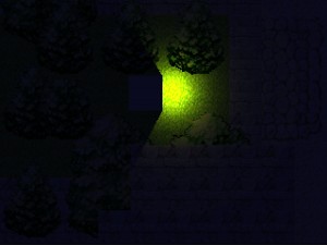
I can draw the scene with textures into this buffer and with a bit of blending magic it makes something like (e). To test out the colour combinations I added a few extra lights and moved the render target to the main camera (f).
Looking at the lighting now it was certainly close to matching the existing unity per pixel lights but it just didn’t have a decent attenuation component. To make this I generated a Texture2D in script and used it when drawing the lights into the render texture. This finally gave results close enough to the Unity lights but now they all have dynamic 2D shadows with a volumetric option yay! (g)
Now this pixelated look needed something else to make it a bit more interesting. I tried a couple of things but adding a mosaic overlay for the pixels seems to give a pretty interesting look.
One of the many things I could add is some kind of HDR fakery for glows and stuff but I think I’ll leave that out for now perhaps…
…now to finish the game!
-Ryan
